Myles Zhang’s portfolio includes beautiful watercolors of New York City neighborhoods; drawings of buildings in Newark, New Jersey — his hometown; and a video imagining the construction of a 12th-century English church.
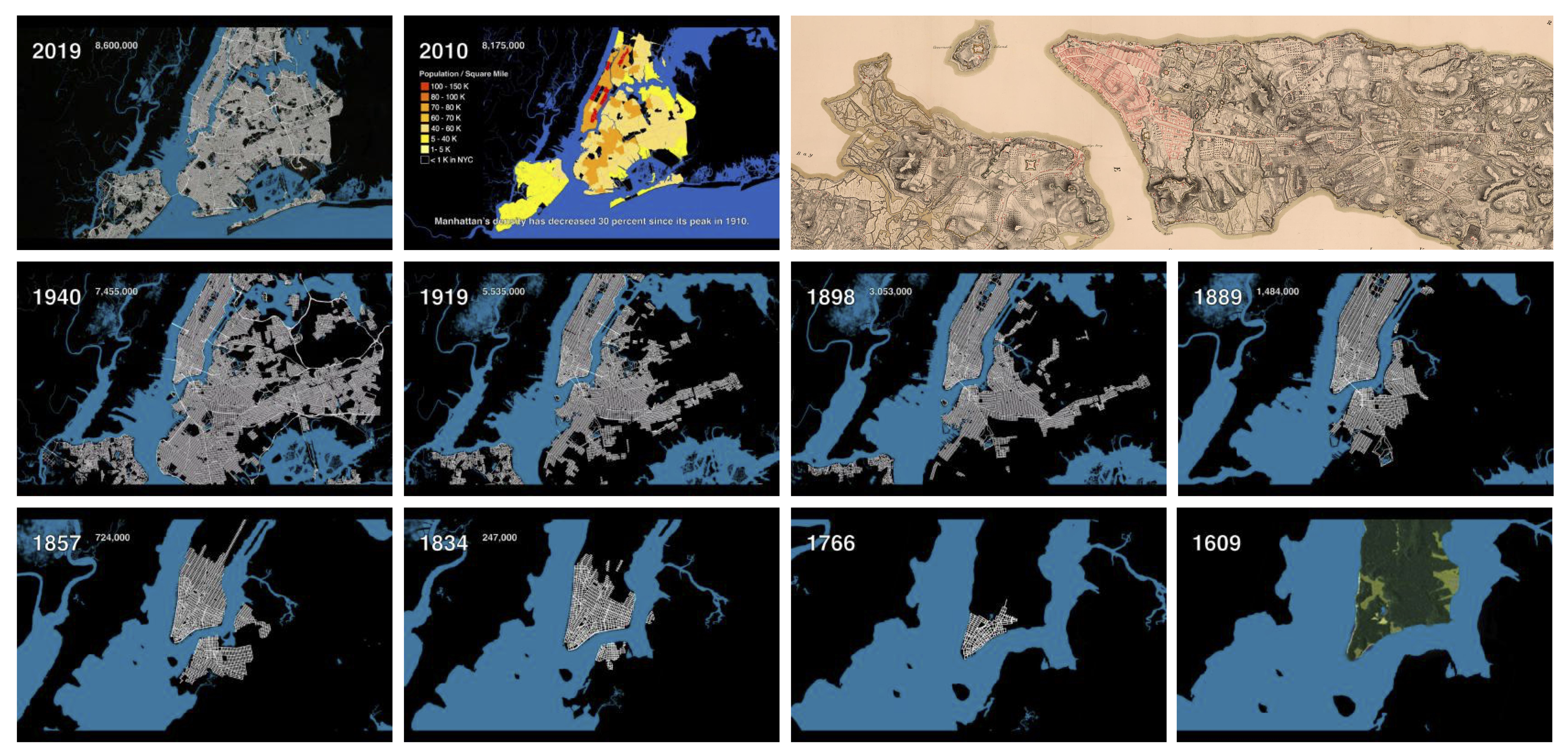
Recently, drawing on maps from the Library of Congress, the Columbia University senior built an animation showing the growth of New York City from 1609 to today. Here, he answers a few questions about his work and his use of the Library’s collections.
Myles Zhang. Photo by Chioma Nwana for Studybreaks Magazine.
Tell us a little a little about your background.
I study architectural history, urban studies and art history at Columbia. My upbringing in inner-city Newark initially inspired my interest in urbanism. From a young age, I’ve painted architectural watercolors, and I’m enthusiastic about website design and computer modeling. With my background in art history, I’m concerned about presenting my research visually in a way that is easy to digest.
What inspired your New York map?
Over the past 400 years, humans transformed the natural landscape of hills, rivers and wetlands around New York Harbor into a metropolis. My interest in this transformation began when I started examining old city maps and realized the locations of many city streets correspond to former trails, streams and valleys. For instance, the winding path of Broadway as it slices across the Manhattan grid follows a Lenape Indian trail. Canal Street, where I go to the barber, began life as a drainage ditch in the wet and marshy soil of lower Manhattan. I realized that visualizing and mapping these changes could capture the scale and pace of human intervention.
Film stills from the animation.
Which Library maps did you incorporate?
The Library of Congress and the New York Public Library have extensive collections of historical maps. The most significant are scanned online and free to download in high resolution. I analyzed several hundred and selected 25 that capture “snapshots” of every 20 to 30 years in the city’s history. From the Library, I used a 1767 lithograph of New York City; an 1807 map of the island of Manhattan; an 1857 city-county map; an 1860 depiction compiled from maps of the U.S. Coast Survey; a 1921 aerial survey; and other maps extending in time to a 1964 street map. I include a full bibliography on the documentation page for the animation.
How did you do the animation?
I began by identifying historical periods in New York’s history – Dutch colonization of Lenape land, English control, American independence and accelerating growth thanks to industry, railroads and immigrants. I found historical city maps for each of these periods.
Individual maps had different dimensions, colors and scales, and these differences made comparison of urban change difficult between each interval of 20 to 30 years. By stretching and warping these maps to align to each other and then redrawing each with consistent color and line weight, the changing pace and type of urban growth became clearer.
How does the animation relate to other work you’ve done?
The animation is about capturing environmental change on a macro level. My art projects based on walking around New York City reflect the microcosm of individual streets and buildings, but not how these streets and buildings are part of a larger network.
I’m more interested in storytelling than I am in the technical aspects of data and animation. How can I use old maps to tell the story of America’s evolution from wilderness to agrarian society to Industrial Revolution to an advanced service-sector economy? The methods of this animation are different from anything else I’ve done. But the objective of visual storytelling is consistent with the rest of my work.
How would you describe the value of the collections?
A lot of historical maps and documents are fragile to handle and unwieldy to move. It is a public service of great value to have these records online, where anyone can consult them from anywhere in the world.
Maps in particular connect people to the history of their built environment. I find the Library’s collection of Sanborn fire-insurance maps valuable in this regard. They document the materials, functions and locations of buildings and streets for almost all major American cities. Streets can change a lot in 400 years; I often use Sanborn to verify how and why a particular street was added or lost.
I’ve also used scanned photos from the Library’s Historic American Buildings Survey collection.
What is next for you?
I’ve two possible animation projects in mind: either an animated history of New York’s water supply system or a data visualization of how the 1832 cholera epidemic spread by street and neighborhood in New York. Records exist from the 1830s of who died and where they lived. Plotting these locations on a map might reveal the geography of disease and help determine whether geography or income correlated with one’s chances of falling sick. Next year, I’m studying for a master’s degree in architecture and urban studies.